TRAINERIZE
We started working with the Trainerize team just over a year before their acquisition by ABC Fitness. At the time, the company was looking to update and realign its brand identity after more than a decade of bootstrapped growth supported by a small but mighty internal design team.
Working closely with founder Sharad Mohan, Marketing Director, and the broader marketing and brand team, we focused on bringing greater clarity and cohesion to how Trainerize was showing up in the world. The process began with a comprehensive brand audit to determine what should stay, what should evolve, and where the biggest opportunities for refinement existed.
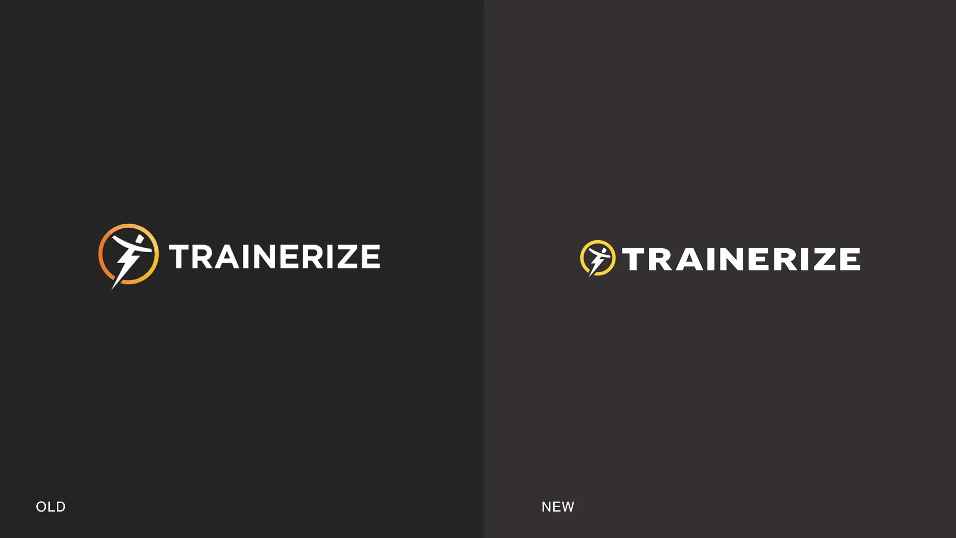
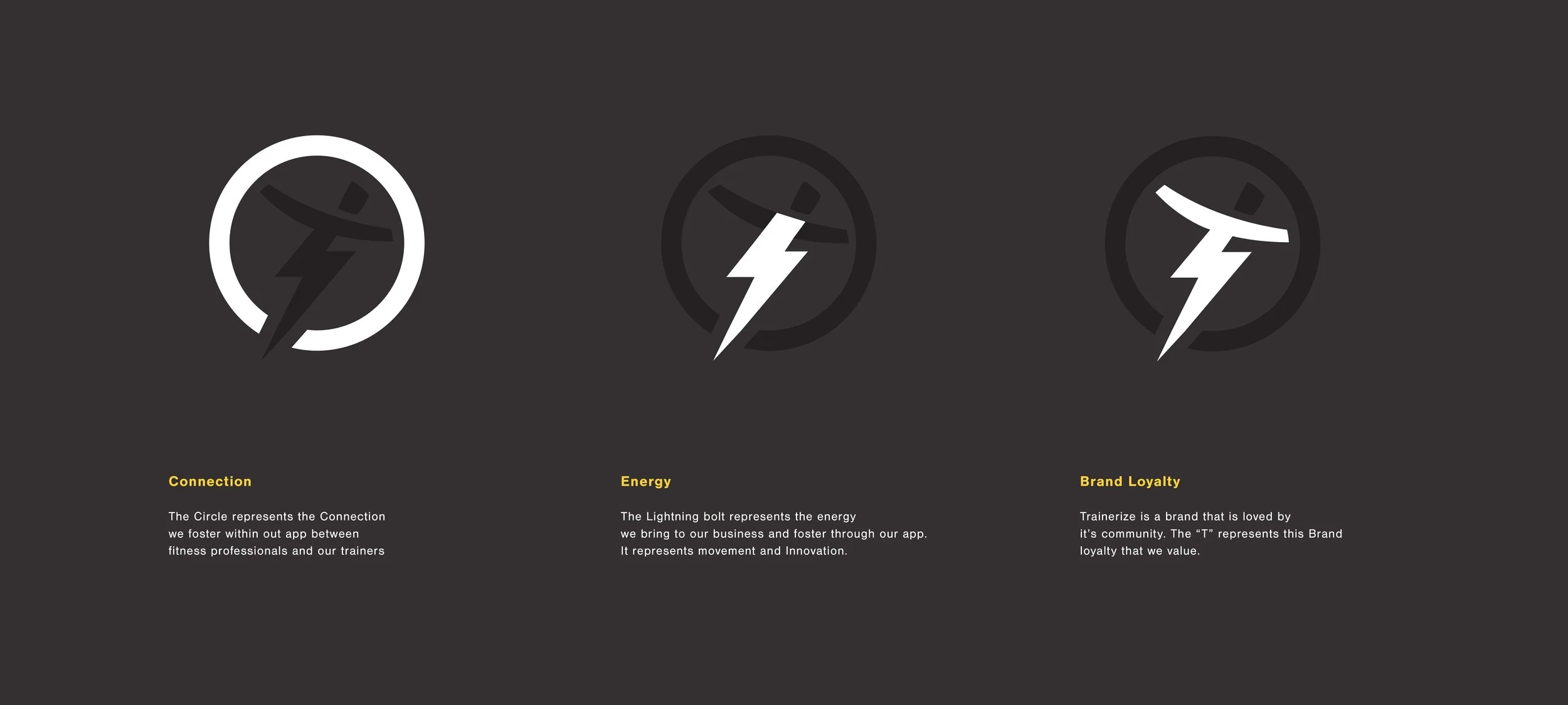
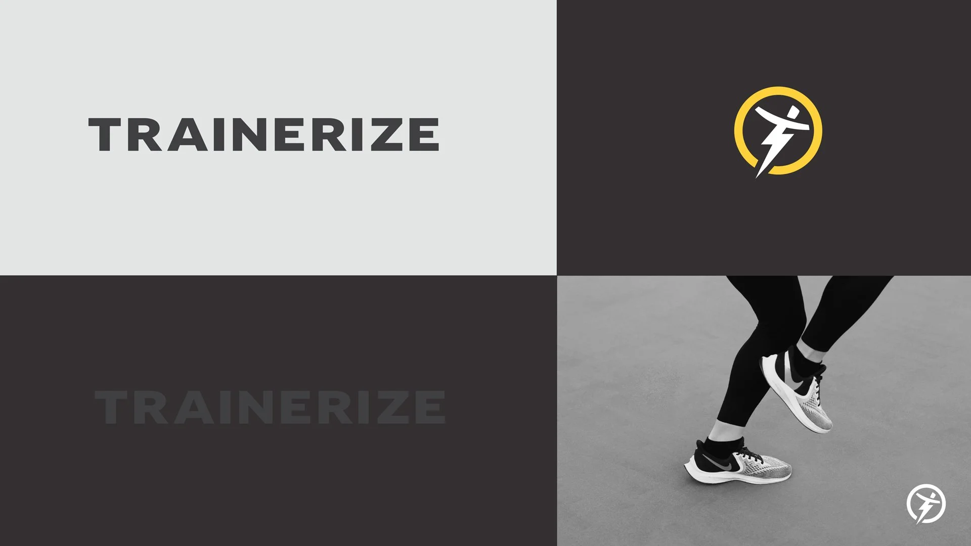
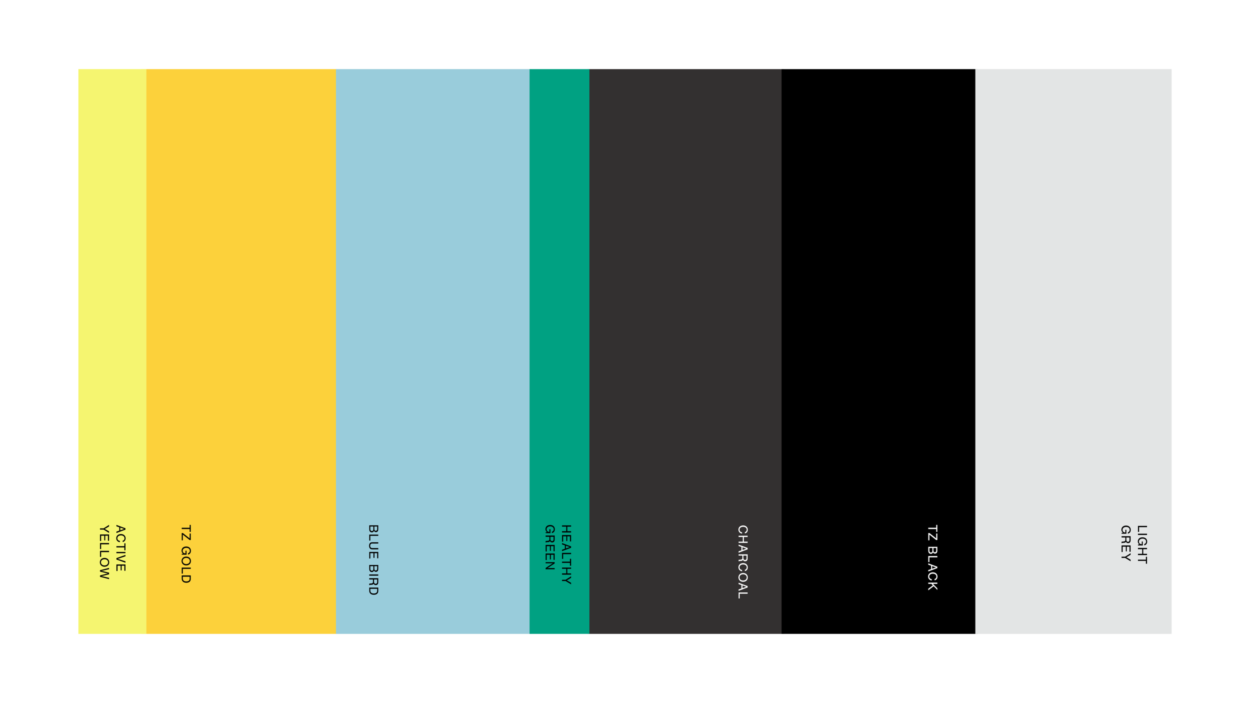
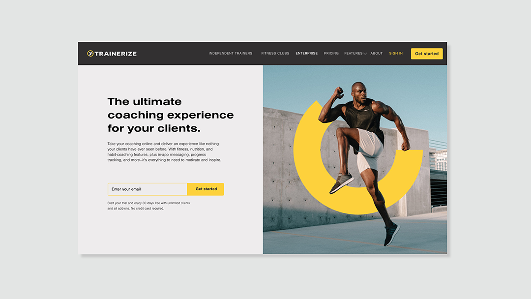
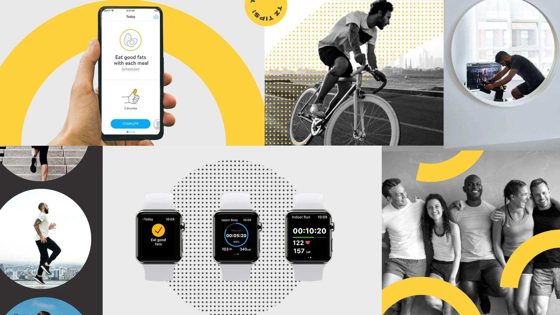
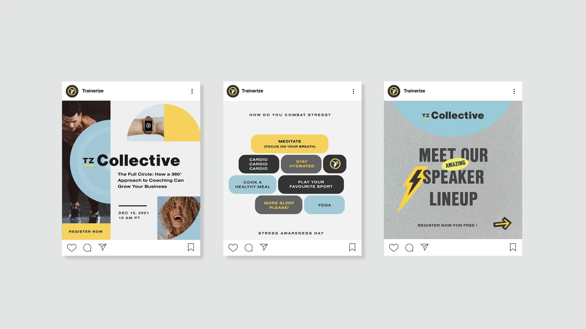
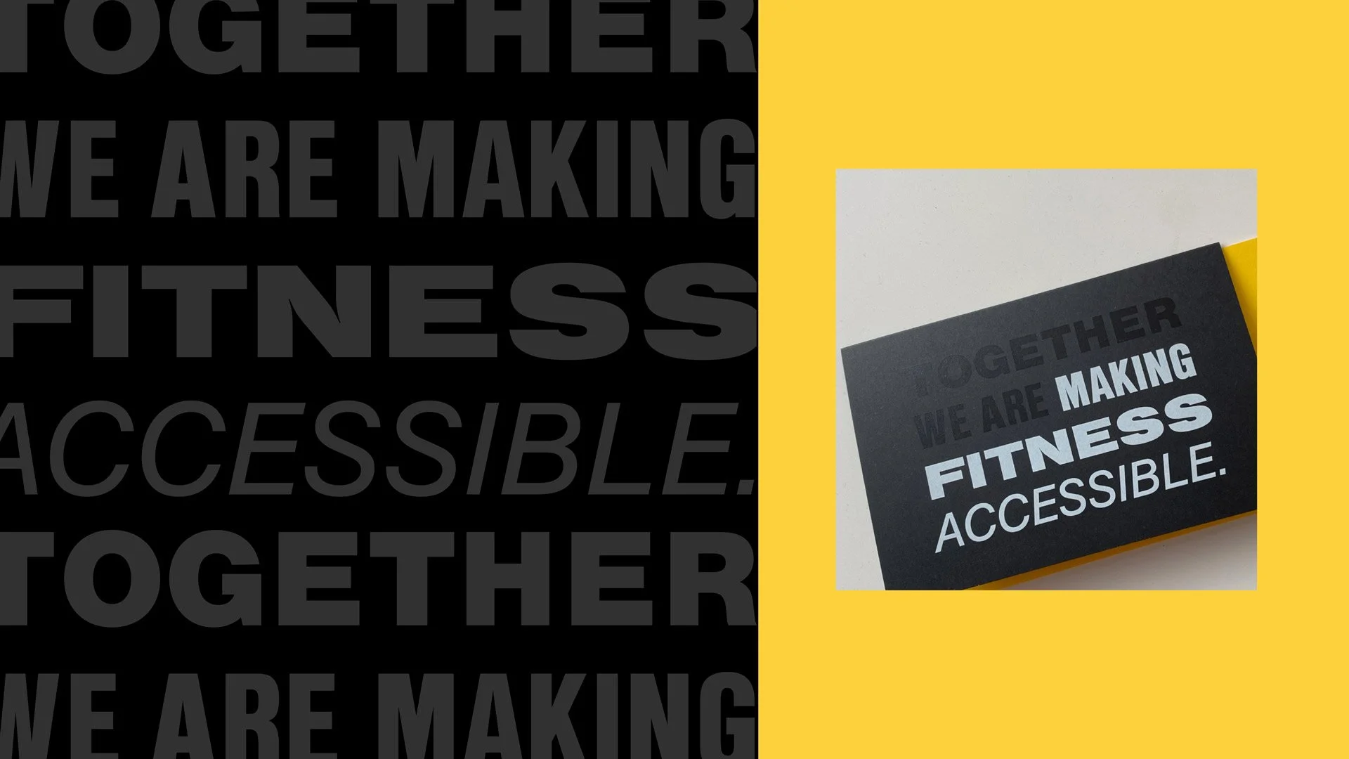
From there, we developed an updated visual language that captured the energy of the brand while introducing more strength and polish. A refreshed color palette, a clearer and more cohesive typography system, and a set of graphics inspired by the original logo symbol created a stronger foundation for the brand moving forward. This system was then rolled out across all channels — from web and social to the Trainerize app itself.
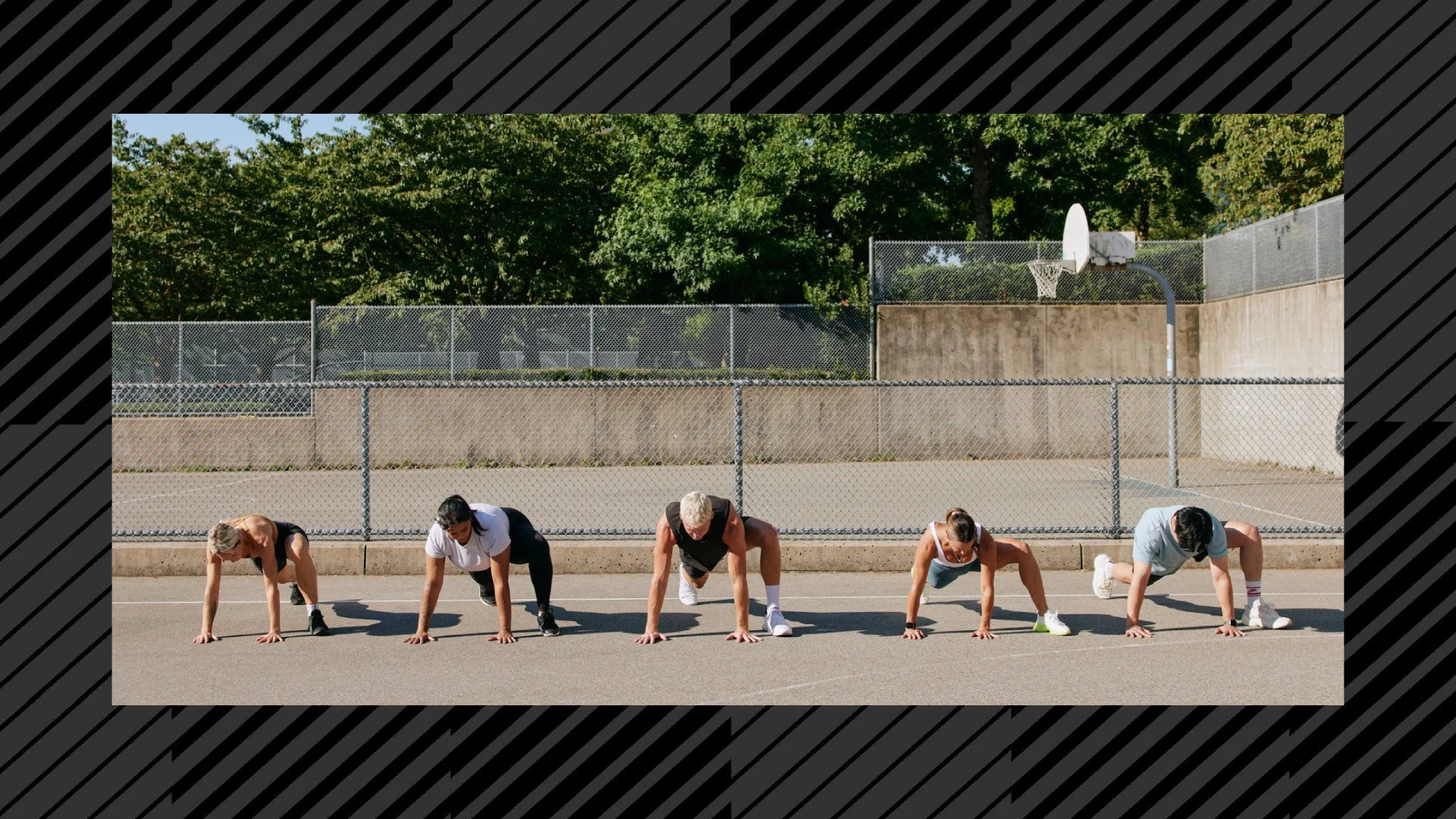
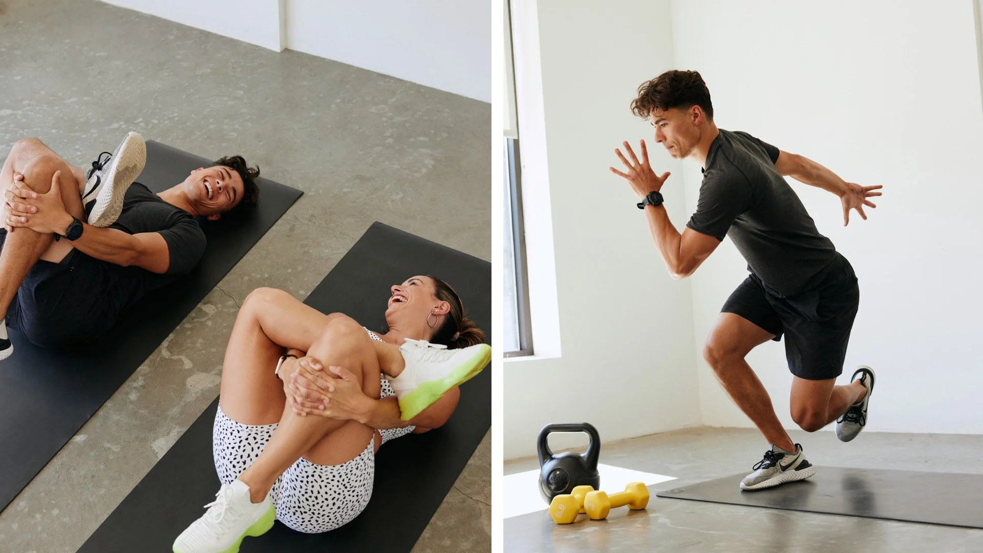
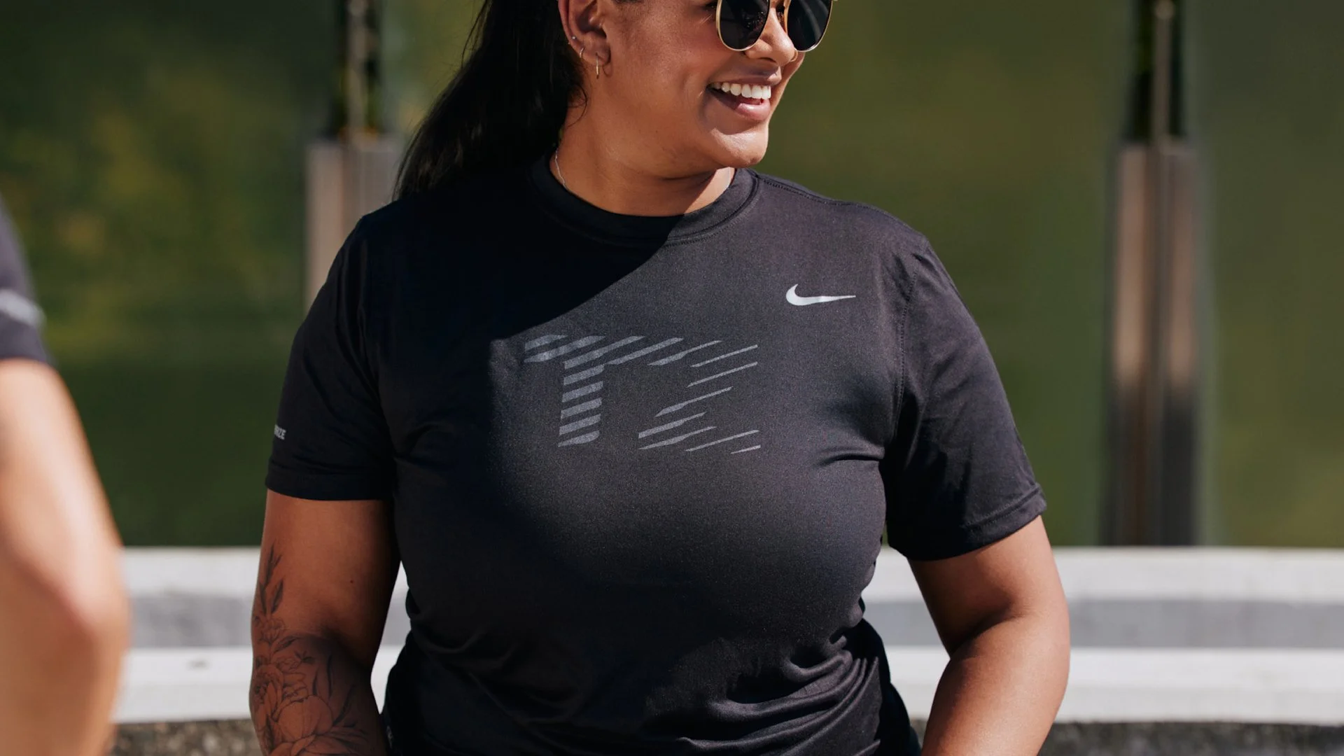
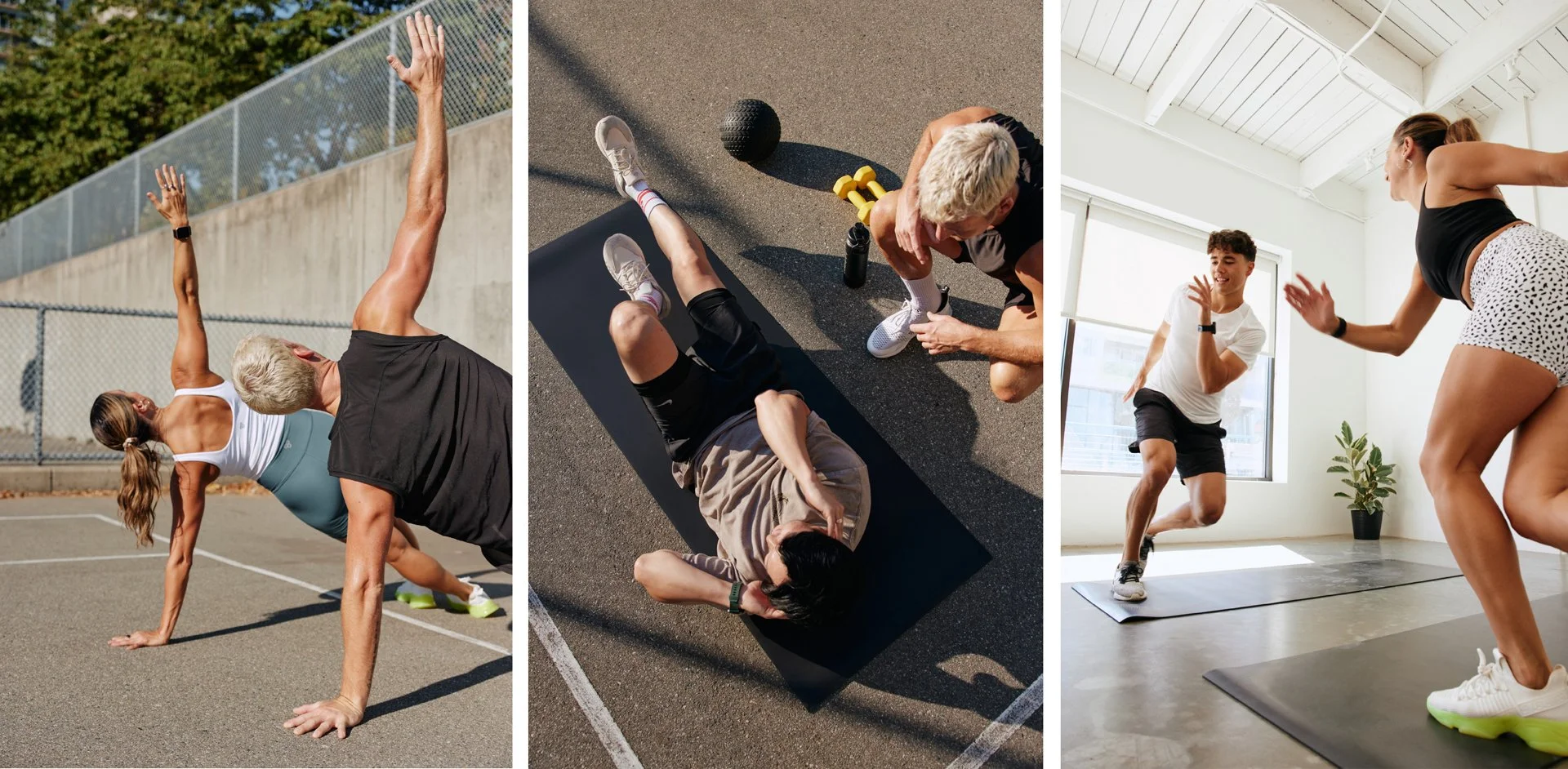
One of the highlights of the project was collaborating with photographer Kezia to create a new suite of brand photography. These assets became a foundational part of the brand for years to come, elevating the overall visual language and bringing a more human, energetic feel to the design system.
Fun fact: Busy Brain also helped design the pitch deck used by Sharad during the acquisition process — the very deck that helped bring the deal with ABC Fitness across the line. It was an exciting chapter to witness, watching the Trainerize brand evolve and grow through each phase of the company’s journey.
Brand Refresh & Roll Out
Creative Direction & Photoshoot Production
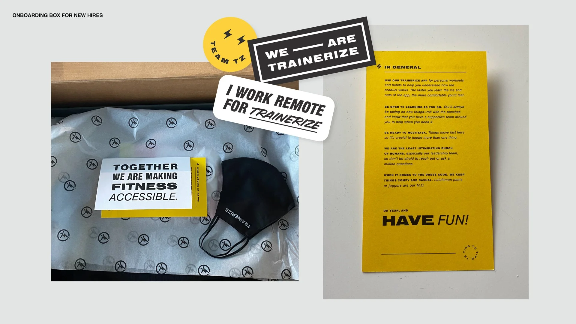
Employee Welcome Box & Corporate Gifting
SCOPELOCATIONVancouver, BC, Canada
CREDITSPhotography:
Kezia Nathe
Printing:
Mitchell Press + Jukebox Print