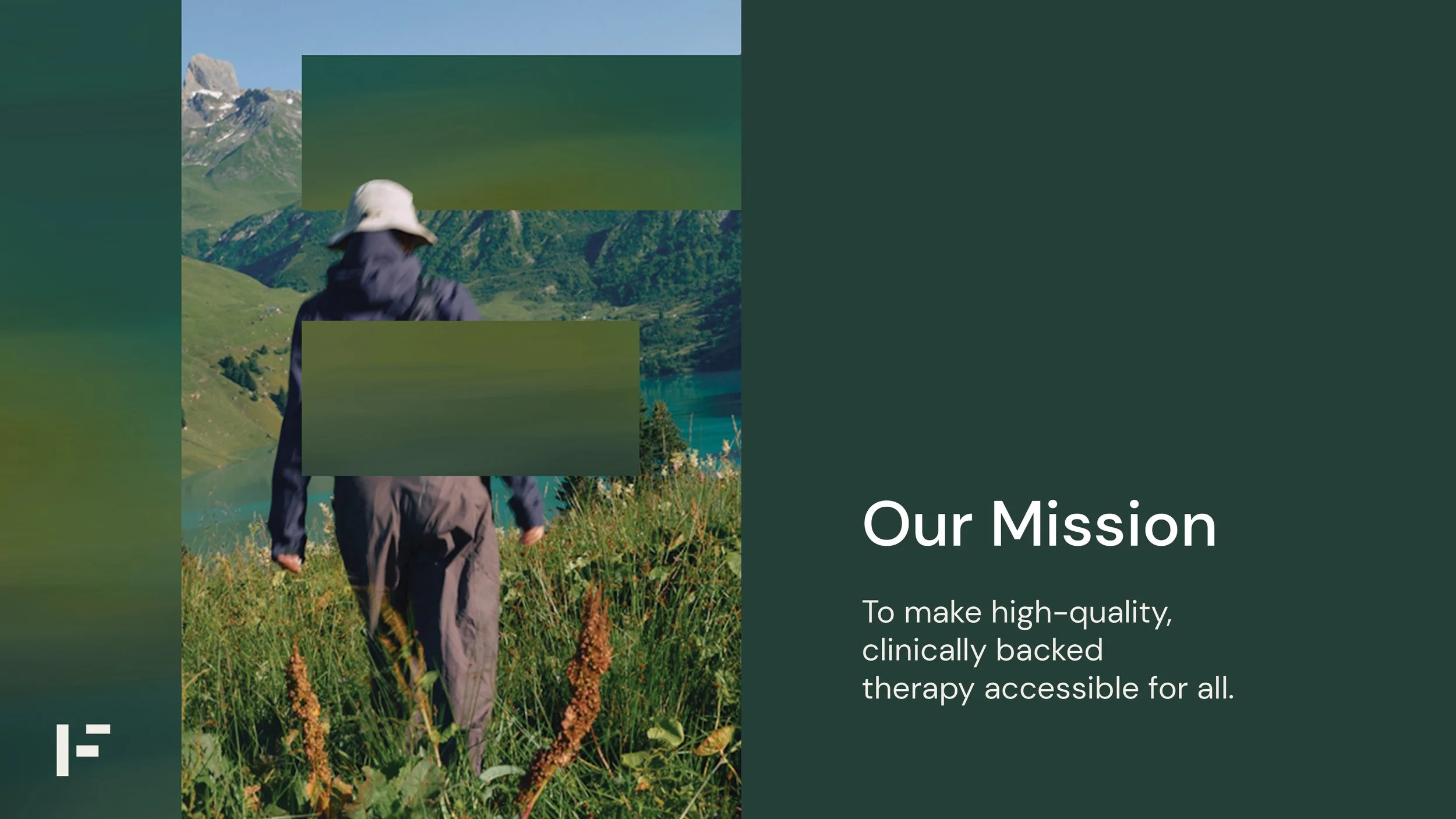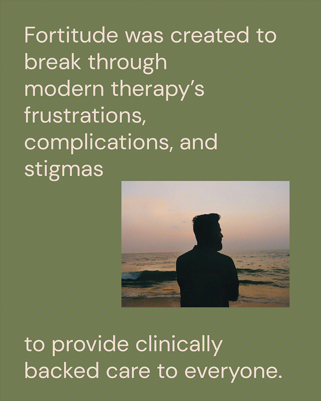
Fortitude is an Ai powered Therapy/coaching tool created to break through modern therapy’s frustrations, complications, and stigmas to provide clinically backed care to everyone.
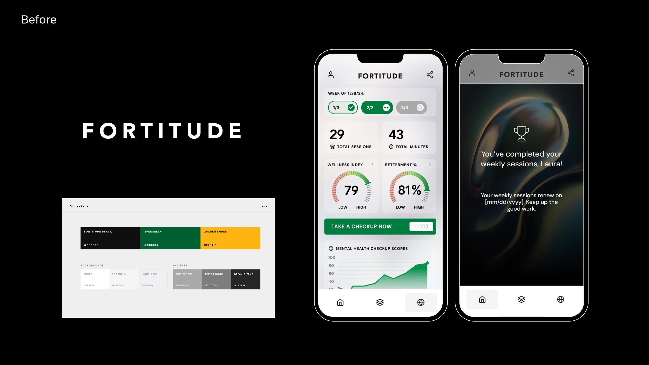
We were brought into the project to help breathe life into the very black, dark tech-y visual identity that they started with. Founders, Laura and Eric wanted the brand to reflect hope and encouragement and really feel like something you’d want to be a part of.
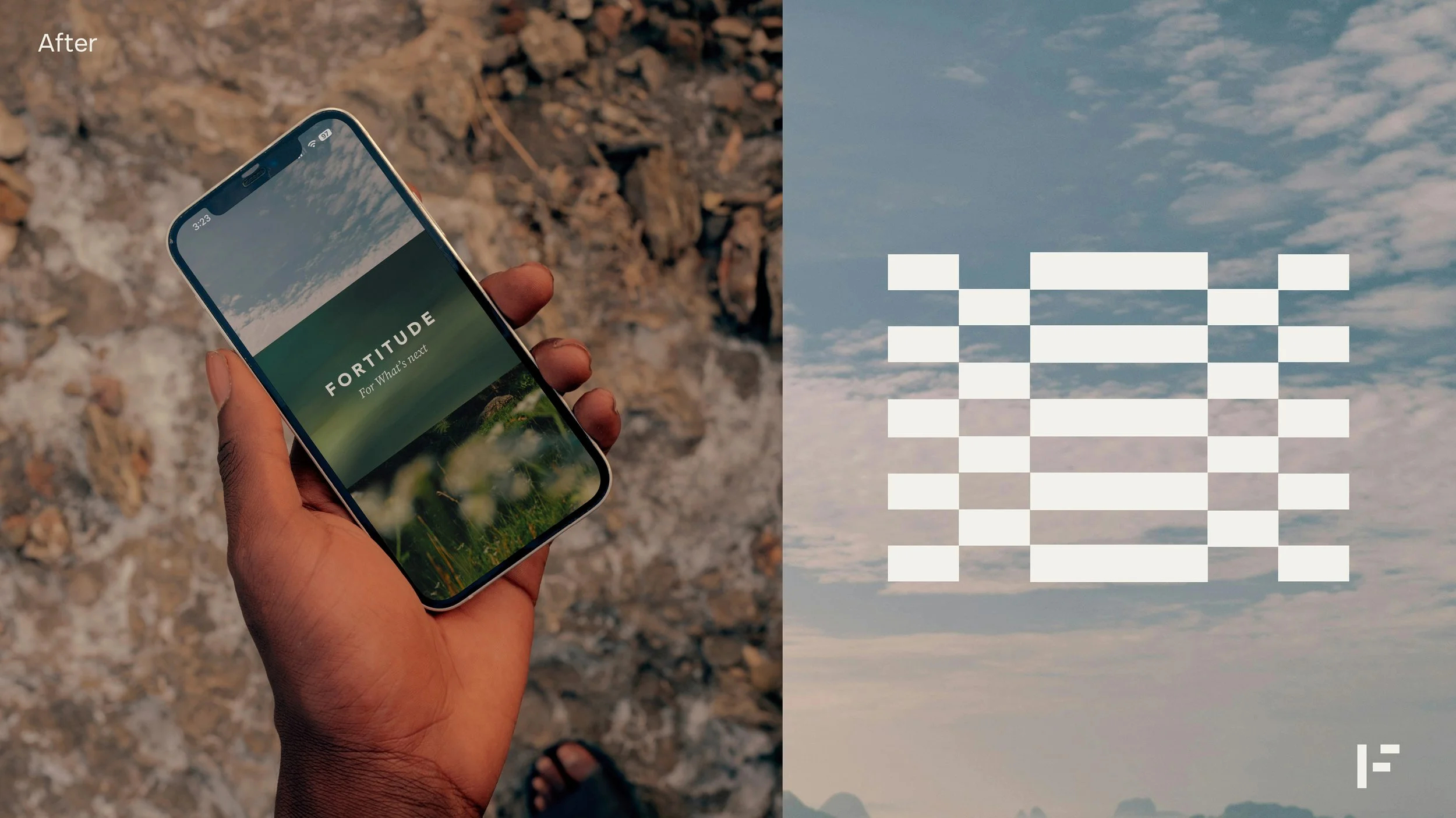
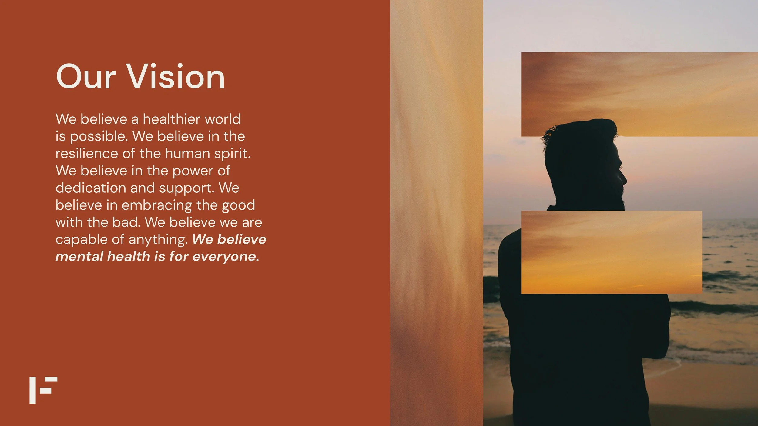
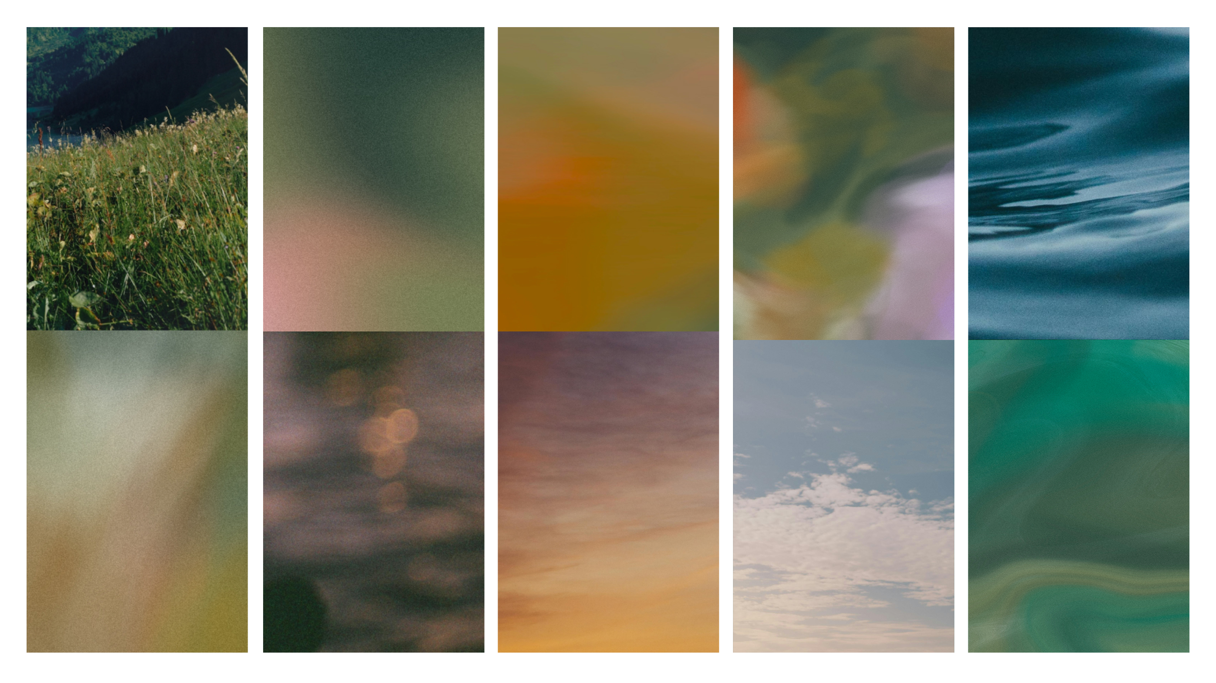
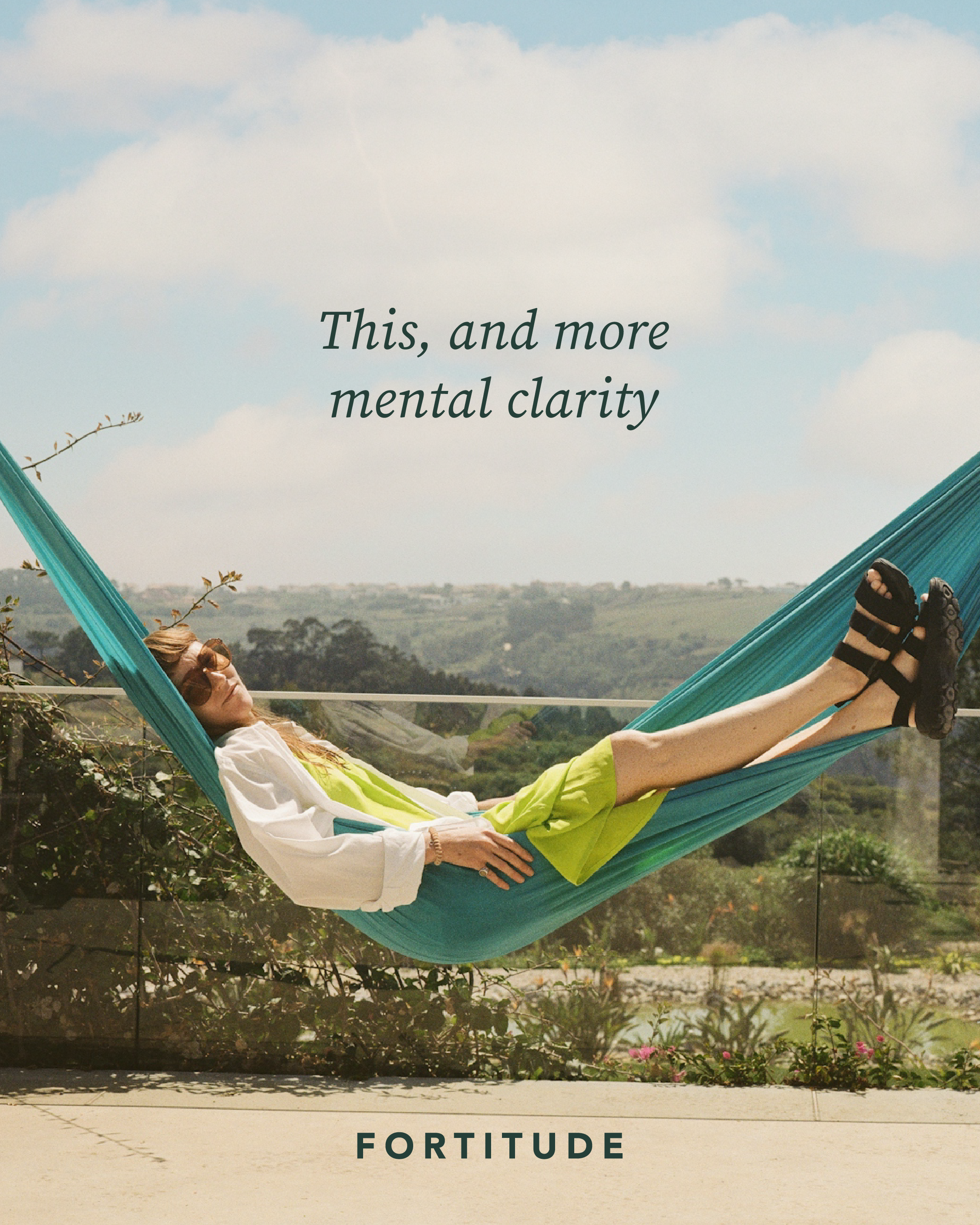
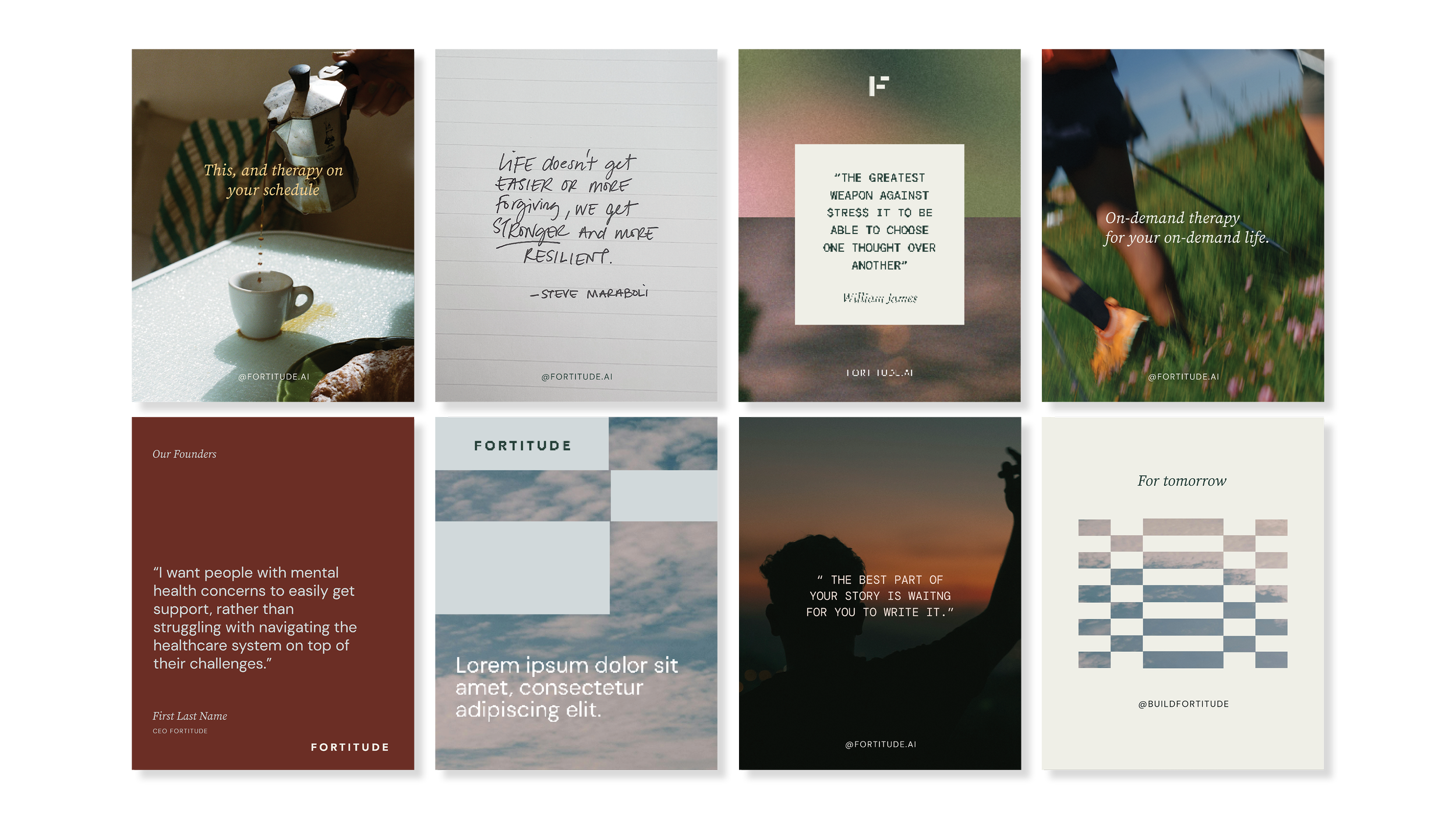
It was important that we humanized the brand (without creepily humanizing the tech.) Fortitude isn’t a person, it’s a tool. The visual direction we went with places Fortitude (the tech) in the natural world - showing the seamless integration and enhancement of one’s life through support and care.
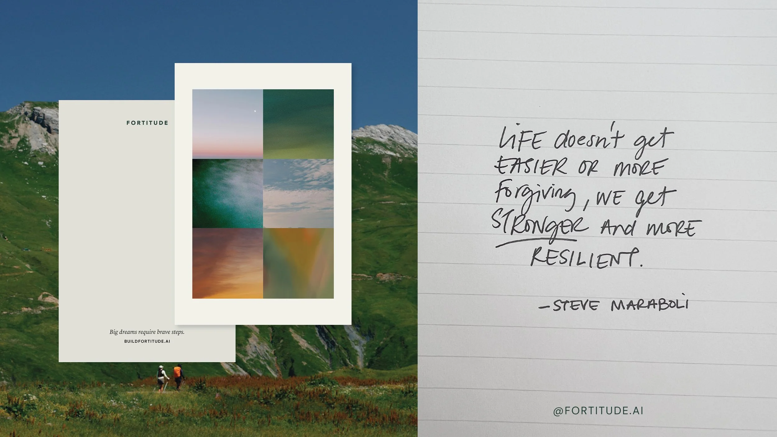
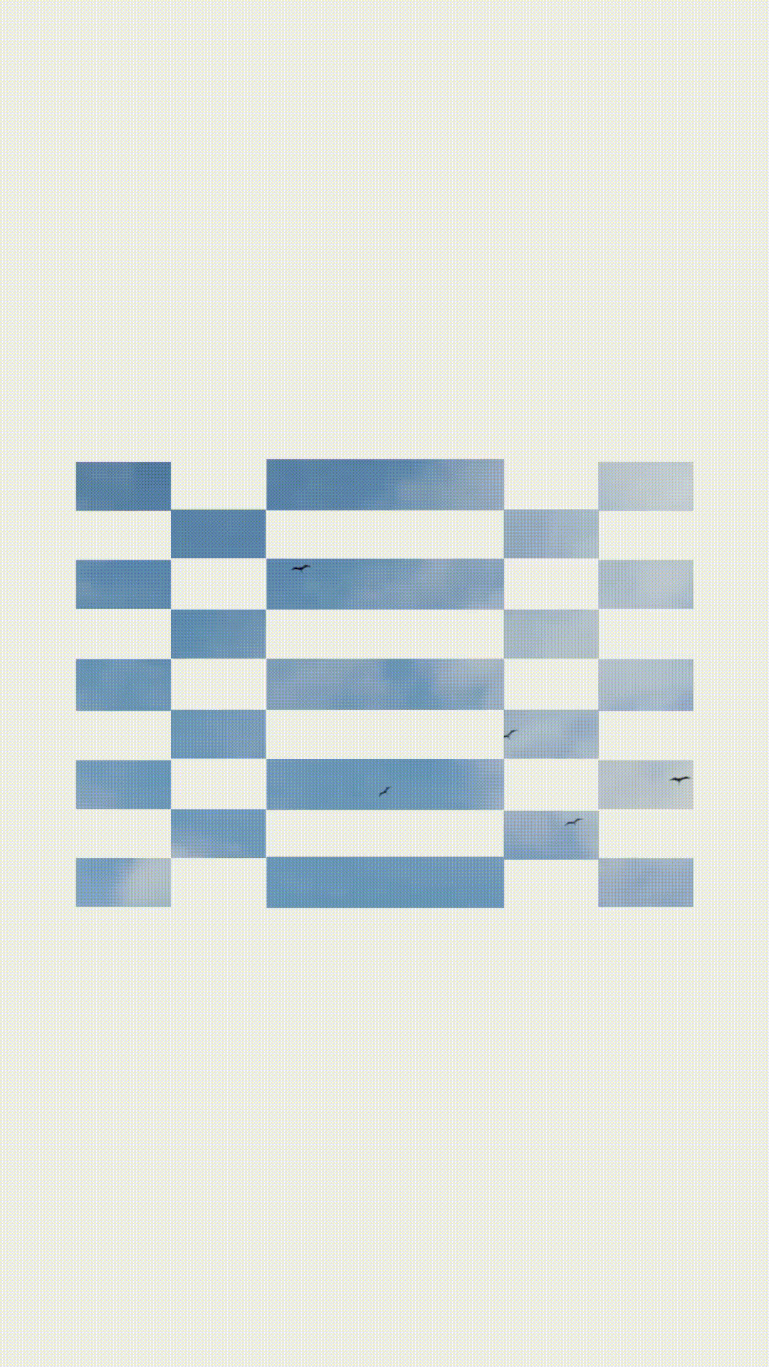
We were inspired by natural textures in nature - sky, grass, trees that help define the brand colour palette an and used those same inspirations to create painterly gradient textures.
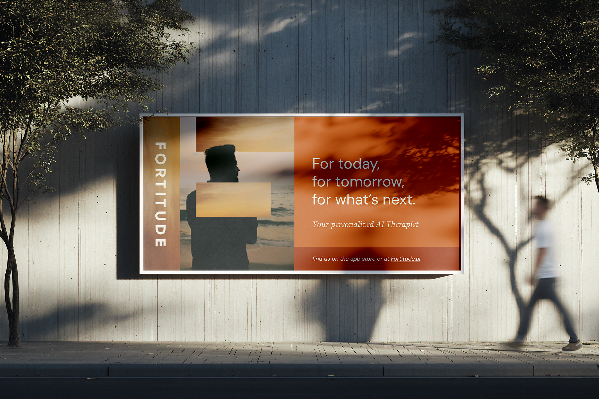
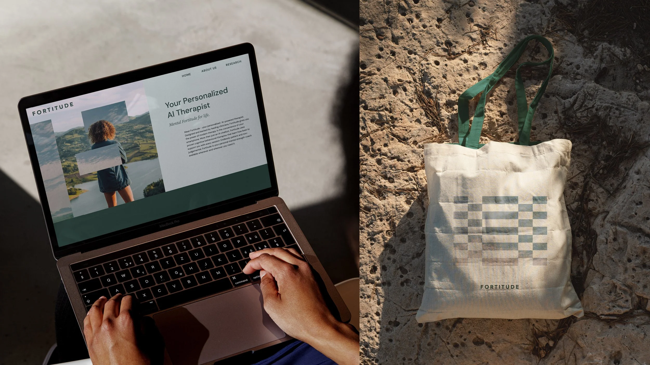
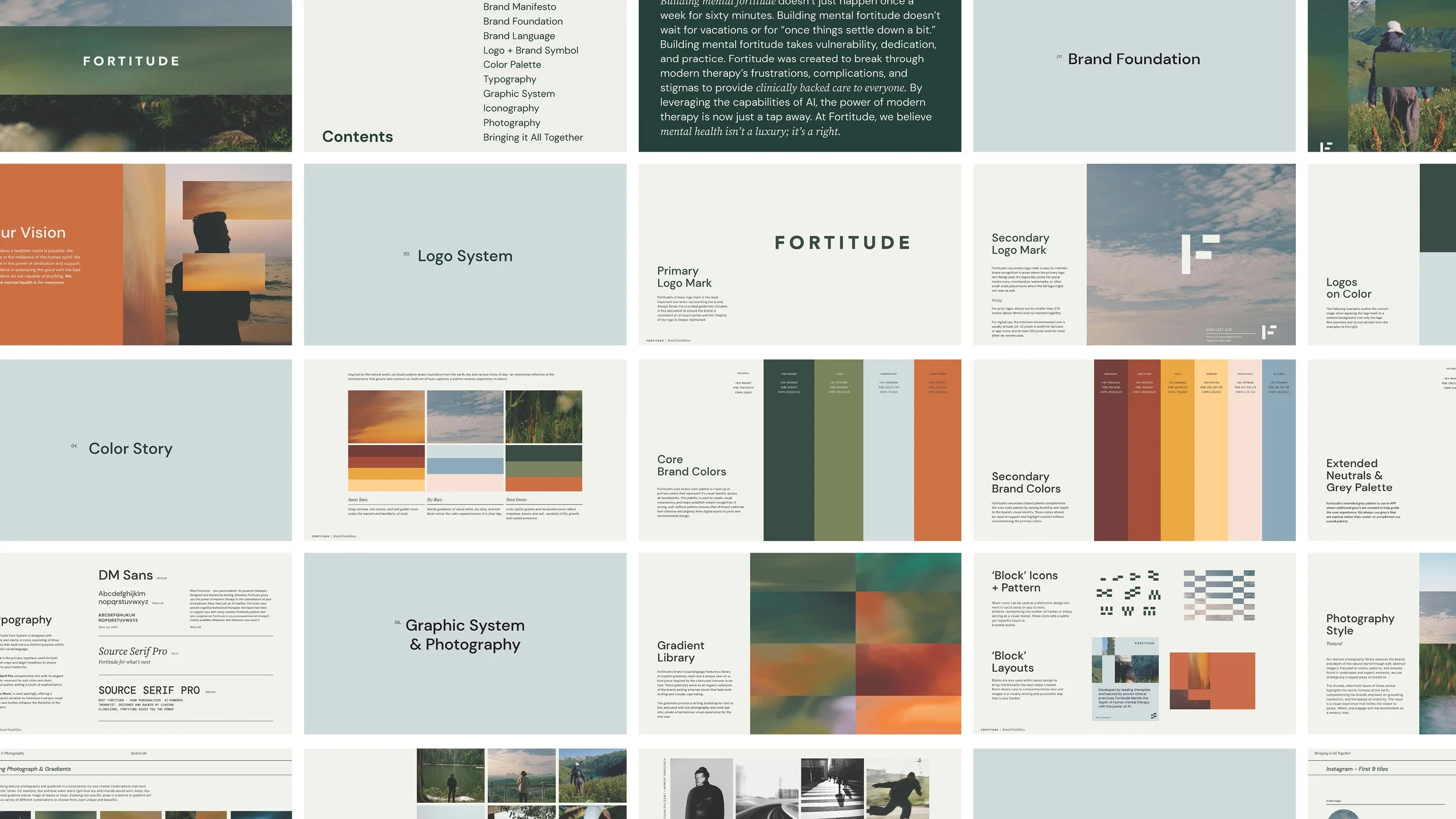
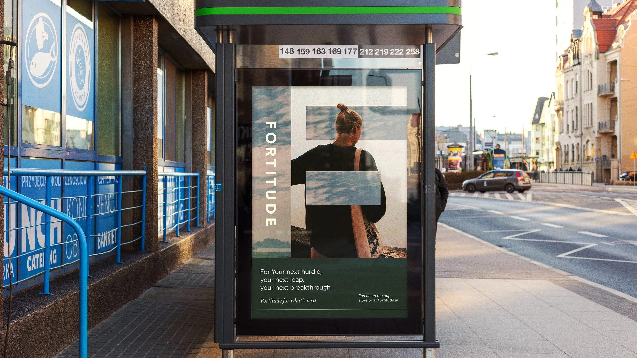
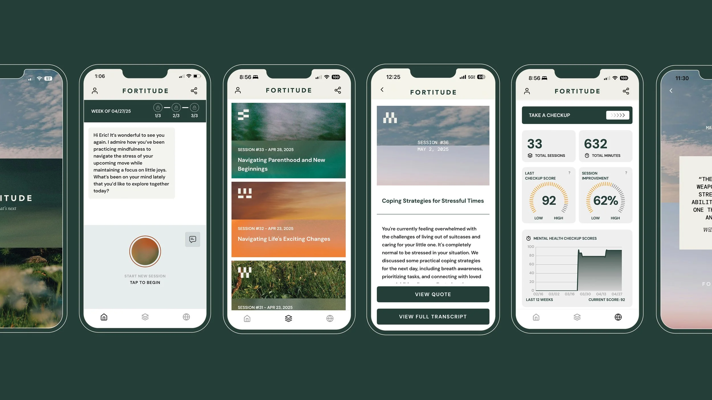
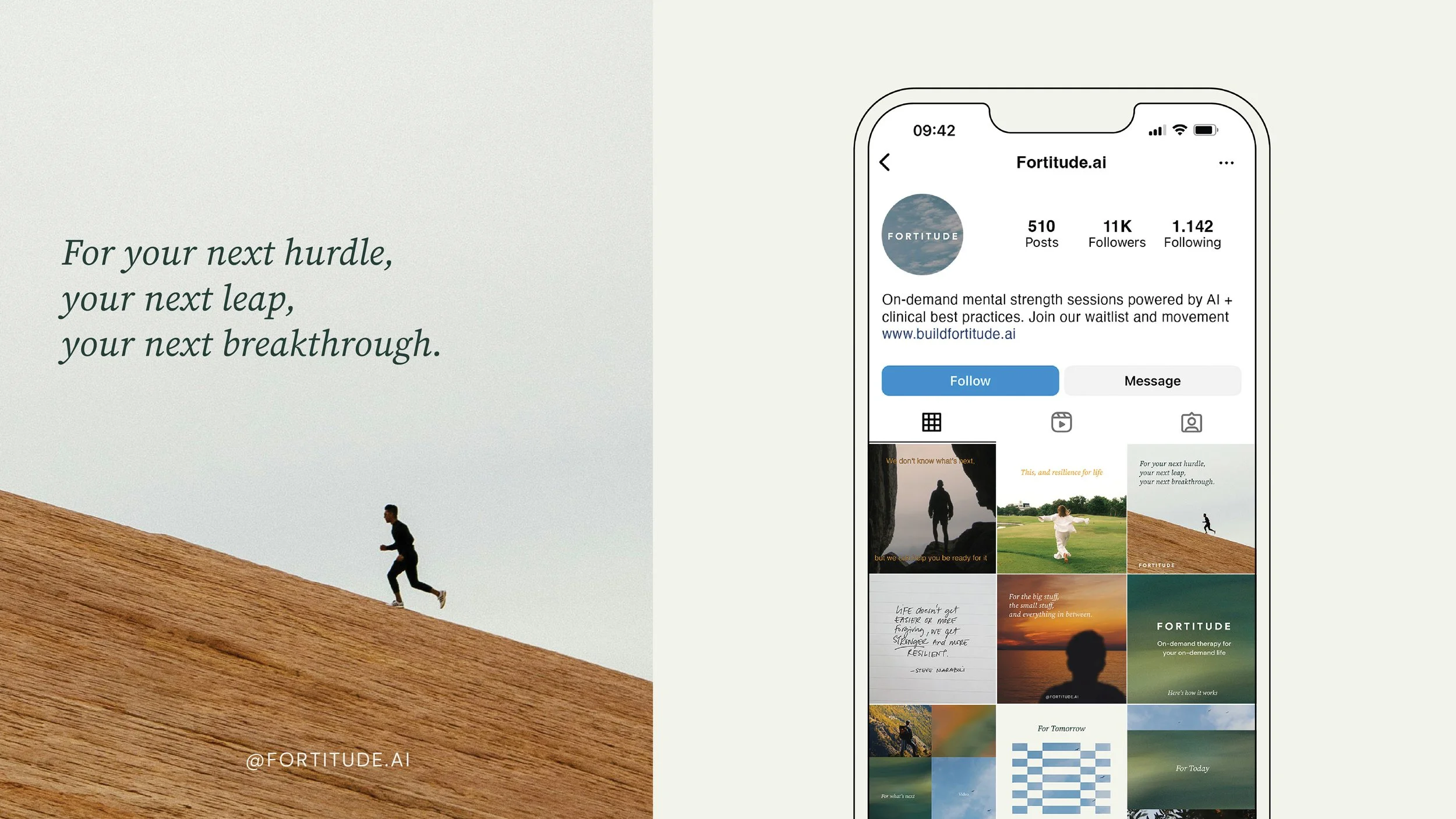
We first applied this visual language to the app itself and then to the website landing page, social media assets and marketing material. Visually layering the textures and photography to create interesting backgrounds and layouts in each application.
FORTITUDE
SCOPEBrand Identity
Social Media Assets
App Design
Web Design
LOCATIONSan Franciso,
California
COLLABORATORScopywriting: Stratton Easter